
There are many ways to make your interior spaces look instantly new and vibrant even after years of use. However, the easiest way to breathe new life into a lived in space is by repainting the walls. A fresh coat of paint can instantly lift the mood of the space and the right color combination can make the room more personal and suitable for your lifestyle.
 |
| Paint a-House Exterior |
Choosing a Palette
Before you narrow down your paint choices to a pair or trio of colors, it is best if you think of the full range of shades for your interior painting project. Think of the entire palette of colors that are available out there and see how they look when they are placed beside other shades.
Likewise, you should think of the overall mood that you want to achieve for a specific space. If you want the room to feel lighter, choose cooler shades or pastel tones. If you want a moodier feel for the room, go for darker or more subdued palettes. If you want a space that exudes energy, then you should go for brighter and more vibrant colors. To get your house makeover started, listed below are a few of the most popular and foolproof color combinations for interior painting.
First Color Combination: Light Gray, Dark Gray, and Pale Blue
Although a pale blue shade can seem overly sweet and childish on its own, it takes on a much more sophisticated look when it is combined with moodier shades of gray. This particular color palette is inspired by the appearance of a stormy sky and evokes a feeling of elegance and European flair.
The cool hues create a soothing and cooling appearance that is easy and pleasing to the eyes. The pale blues and grays best complement furnishings that are in varying shades of gray, brown, taupe, and other neutral shades.
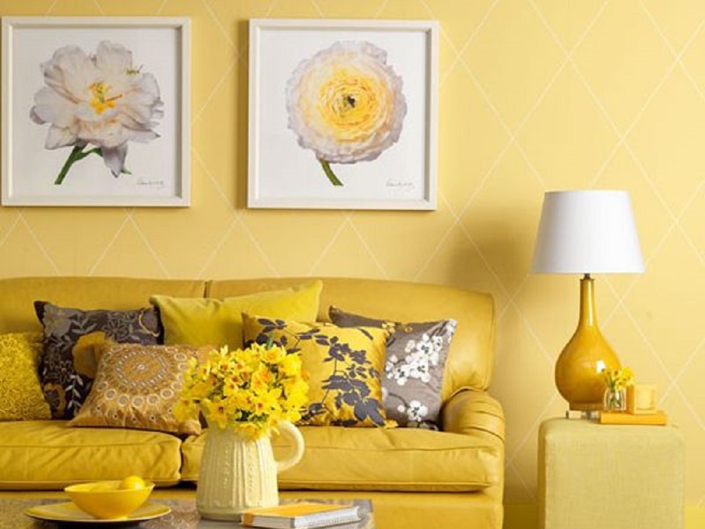
Second Color Combination: Cream, Golden Yellow, Butter Yellow
This palette is a great alternative for homeowners who are not adventurous enough to take on a more vibrant color palette. Nevertheless while the cream shade does offer a safe step away from a boring beige, the addition of the sunny yellows and golds bring in much needed warmth and liveliness into a room.
 |
| Interior Painting |
Fortunately, the golden hues are toned down enough so that the overall feeling is that of happiness rather than of a blinding barrage of yellow. The creams and golden yellows best complement furniture and flooring in dark and rich shades.
Third Color Combination: Berry Red, Dark Red, Burgundy Red
Red has always denoted power and aggressiveness. As such, it is a color that should be used with great care and thoughtfulness for your interior painting project.
While you might think that a lighter shade might help to tone the red shades down, it could actually result in making it seem even more garish. In truth, when it comes to suing such a forceful color, the best course of action is to go toward the darker spectrum of colors and pair it with even darker complementary shades. The gradual gradation of colors results in a room that is dramatic but also relaxing since the gradation is more subdued.
This color palette best complements clean and modern pieces that will not fight for attention in a room that already has such an eye-catching backdrop. As long as it is used properly, this powerful palette can create a dramatic and powerful effect that can serve as the focal point of your home.
About the Author: Jason has 10 year experience in the housing industry, brings a unique vision to the painting industry on how to deliver products and services to customers. Mr. Coke’s experience is diverse and includes collaboration with some of the Dallas-Fort Worth Area’s top interior designers and decorators. He also has been involved in construction of homes with one of the nation’s largest home builders.